This is the one about COLOUR MIXING….
This post is for all the dear people who follow my colour recipe reels on Instagram. I thought it would be handy to summarise where I am coming from and to share the framework I use (and have used for over 15 years. )
As I have said several times in my reels, my understanding of colour theory has been greatly enhanced by Tracy Holmes over at Breakthrough Colour. There’s various models for colour and people find a framework that works for them. Different brains!!! For me, Tracy’s model makes a lot of sense; it helps me do what I need to do and I learnt about it at just the right time. I was working with the women at Samunnat and needed a way to talk about colour. Colour theory is not taught at school in Nepal (for those of the women who’d been able to go to school!) While this meant they didn’t have to unlearn wrong stuff (calling red, yellow and blue primary colours for example!) it did mean that we needed to find a common colour language…a way to discuss colour and how to use it as an element of design. Having our own basic colours (not quite primaries but more on that later!!) and a common understanding of words like hue, tint, shade, tone, value, saturation etc was hugely valuable. Vital even!
Tracy has recently started The Colour Room which is (in her words) an online space that’s part creativity gym, mixing lab, palette playground, resource library, and full gamut chat lounge, designed to connect to wherever you work and play with colour in your real world: art studio, classroom, design space, kitchen table, coffee shop, cottage… It’s full of people who work with colour in many different contexts and the aim is to help develop colour fluency and confidence. I’m not an ambassador nor am I sponsored to promote it. It helps me so I am telling you about it in case it’s what you were looking for too!

At Samunnat, it’s more efficient and economical to mix our own colours and, besides, we all love mixing our own colours! To date, we’ve been using the now discontinued KATO clay (insert sad face!) our mixing colours were the three Kato primaries: Blue, Magenta and Yellow. Bless Donna Kato for making the range like this. We actually found that if we made what we called Mixing Blue (a 1:1 mix of blue and turquoise) and Mixing Yellow (Yellow with white…can’t remember the proportions but the Samunnat girls know!) our mixing was easier. Then, as well as Black and White, we also used Donna’s secondary colours: Green, Ultra Blue and Red. In addition, we used Orange, Brown, Purple, Pearl, Gold, Copper and Silver. Every colour we mixed was made with combinations of two or more of our 15 core colours.
This is what my reel cover shots are like…an excited face and a colour!
We are transitioning to a new clay and are currently testing out a few options for suitability to our needs but so far Cernit is the front runner so all of us, the women over there and me over here, are experimenting!
Originally, I wanted to only use the 250g packets from one Cernit range, the Number One, but there is no good mixing magenta or blue in this range so I use some colours from the Opaline range. Unfortunately, the good mixing colours are not all available in larger packets which is hugely frustrating for me, not to mention expensive. I wish Turquoise from Number One was available in a 250g or, better still, 500g packet. Currently, only black and white are available in the 500g blocks. And I even more fervently wish that there was a good primary magenta in the Number One in 250g blocks.
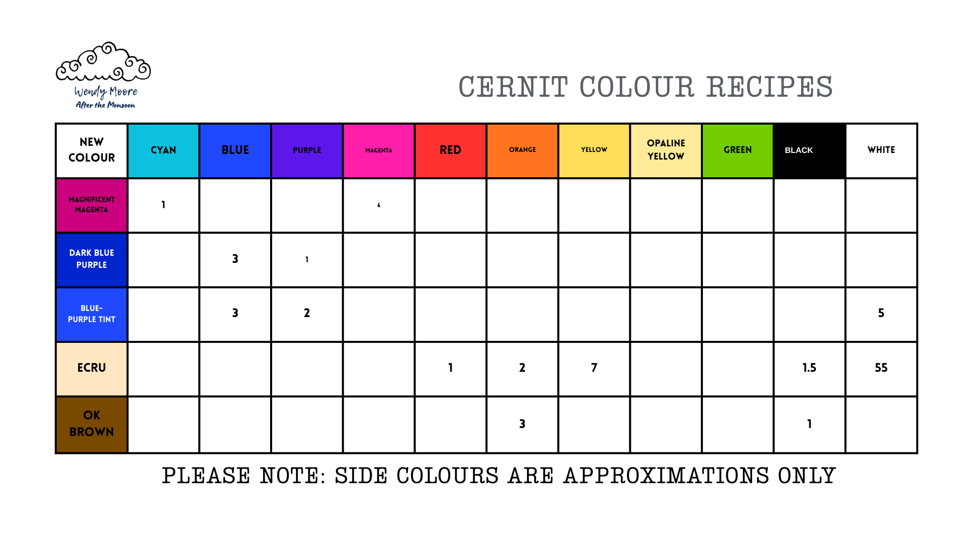
So, what are my core colours using Cernit?
In the absence of a good primary Turquoise in the Number One range 250 g packets, I get multiple packets of the Turquoise 56g but this would be great in a 250 or 500g packet! In the absence of a good primary Magenta in the Number One range in ANY size, I use the Magenta from the Opaline range. This is available in 500g as is a good Opaline blue and yellow. The Opaline yellow is better (IMHO) for mixing than the Number One Yellow so I use both at the moment. I use all the colours in the Number One range that are available in 250g except brown and pink. This means that I use green, blue, purple, orange and the red (an odd red!). I buy black and white in 500g blocks. When I write the recipes, I make it very clear which colour and from which range I am using! I have made a table that people might want to use if they are recording the recipes from Instagram. Let me know if you’d like a copy. Just email me and I’ll send it to you. If it is useful to you, make several copies and fill it in! Maybe you can click on it and do that??
My memory is not good. I get distracted and easily lose track of the number of parts I have used so over time I have developed a technique to minimise my own confusion!!!
I sheet out the colours I am using to create my new colour, all at the same thickness. The cutter I use to measure my parts varies. If I think that there are only a few colours involved, I will use a larger cutter (bigger parts) than if I have many colours. BUT I am generally only mixing enough to make a sample tile to start with. I don’t need buckets of the wrong colour!!! So, for example, with my ecru colour, which I knew would have a lot of white (55 parts as it turned out!!) I used the smallest round cutter.
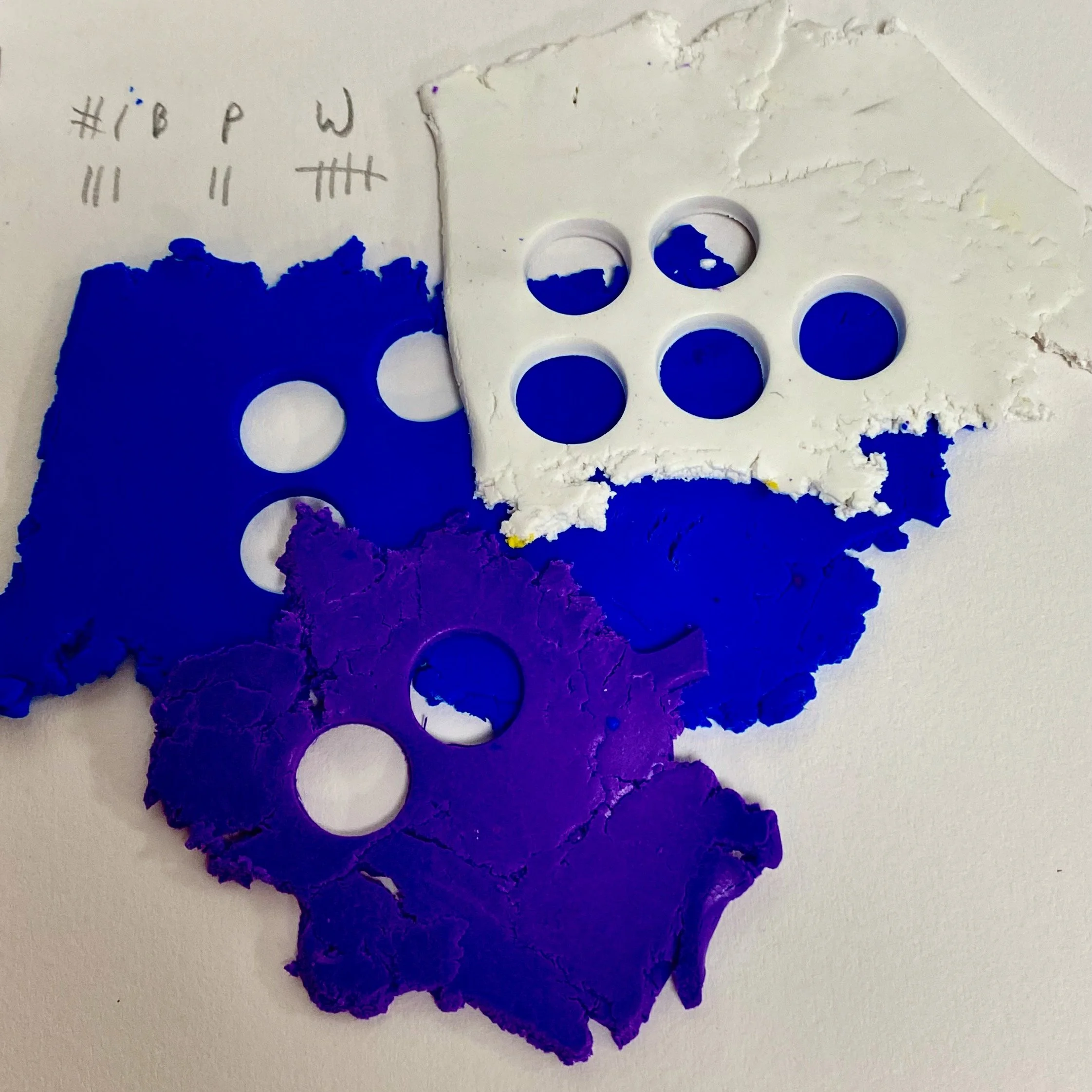
This is an important bit!!!! I keep the sheet with all the empty holes as this helps me keep track of what I have used. If I need more, I DO NOT JUST RE-SHEET THE LEFT OVER COLOUR!!! I cut and condition more; and sheet that to keep track of numbers. AND I write things down on the way. I make a note of what thickness I have used in case I forget. Because sometimes I do and that would mean my parts were different!! You may have a much younger, sharper brain and not need to do this but can I just say, it is VERY easy to forget when you are adding a few colours at a time or taking a long time to gradually change a colour. Just saying. This photo shows what mixing my Blue-Purple Tint looked like! It was a good visual reminder that I used 3 parts of blue, 2 parts of purple and 5 parts of white!!
I will collate my ongoing Cernit colour recipes and will update it every week or so and you can find what I have done SO FAR. I LOVE mixing my own colours and I think it means my voice is a little clearer. Obviously you can still mix colours using a vast array of colours but I guess this works for my easily overwhelmed mind! You could almost call it constraints! And in the process, I am learning so so much about colour theory and how to create the palettes that I want to make! If you are a subscriber (free!) and would like me to send you each month’s new colours, comment below and I will do that! Some months there might be 15-20 colours. When I am in Nepal, there may not be any! It’s like life…a mystery!